http://vector.tutsplus.com/tutorials/designing/create-a-quick-one-page-portfolio-in-indesign/
This site is very helpful in creating a digital portfolio. It not only offers instructions on different layouts and tools within InDesign, but the site also gives ideas that should be considered within the creation. This site offers instructions to make a quick portfolio. Although we will be spending more time in class, it is helpful to know different shortcuts available in the creation. The website demonstrates how to do things in a group, so that time is cut down in the creation and the page is unified.
Tuesday, April 20, 2010
Friday, April 16, 2010
Blog Reviews
A. How did you decide which blogs to review?
The first blog I looked at was the person ahead of me, as assigned. For the other to blogs I choose people that I have had other classes with, or that I know. Both the others I choose are people I had ceramics class with, and thus have spent hours with them in the studio. I choose these people because I thought it would be interesting to see what they write about.
B. Why did you select the individual postings to comment on?
After reading the blogs I found that I was most attracted to those who had pictures posted in the blog. I was able to see directly what the blogger was talking about as they reflected on the images. I also choose blogs that were directly related to the person, ones where they were talking about themselves rather than just reviewing something in the blog.
http://mccacm49.blogspot.com/2010/03/images-for-inspiration.html
http://pamrubel.blogspot.com/2010/03/self-portriat-what-i-want-to-portray.html
http://398spring2010.blogspot.com/2010/03/blog-post.html
C. How could you use a Blog in your classroom as a communication tool? If not, why not?
I think a blog can be a very useful tool within the classroom. It can be used as a way to stay in touch with students as assignments, questions and projects can be posted on it . This would allow students not only to remain in contact with the teachers on days they may not have class, but also allow for students to contact each other with questions or see each others work.
Monday, April 5, 2010
Exploring Online Resource Sites
http://www.apple.com/education/
http://www.adobe.com/education/solutions/k12/crosscurricular/
From the section Cross-curricular resources I would use the article entitled Digital storytelling within my classroom. Learning how to visually narrative is important for those of all ages as we are living in a visual world. Also creating digital stories is a lesson that can be adapted to fit those of all ages. Thus it can be taught at a beginning level, and then become more advanced for older students.
http://www.apple.com/education/
http://www.apple.com/education/teachers-professors/resources/
A resource from apple.com I would use in my future classroom is about creating movies/ films through the use of apple products. The “Making a Movie” Curriculum outlines possible lessons and ideas of what to teach a class about movie making. From this resource I could either directly use the lesson ideas outlined within the article, or I could create original lessons that are based off of those within the article.
http://www.edutopia.org/
http://www.edutopia.org/social-emotional-learning-introduction
This site offers an article on “Why Champion Social and Emotional Learning?: Because It Helps Students Build Character”. I would use this in a classroom, because it is important for students to learn socially and emotionally in school, and the art classroom is where students are able to express themselves. I would utilize this resource by designing lessons that emphasize emotions and that work in groups. By doing this students will have to analyze their emotions in order to create art from them. By working in groups students learn to compromise and use teamwork
Wednesday, March 24, 2010
Adobe InDesgin Videos
- Setting up a New Document
Facing pages allows you to see inside and outside margins; deselecting this you se left and right margins. The page size can be adjusted from presets, or a custom size. By default bleeds are linked, but this can be changed so that they are different sizes. Even numbered pages are all on the left side. Right clicking on this allows you to change how you view the different pages: vertically, sequentially or horizontally.
- Using Layers
By using different layers you can gain complete control of the document. Double clicking on the title of the layer allows you to change the name of the title. Clicking and dragging allow allows you to change what the top and bottom layers are. By locking a layer you are no longer able to select what you are clicking on. Only what is visible will fit, but this can be adjusted by clocking on the layer.
- Using Control Panel
The control panel is located at the top of the screen- giving you access to the most frequent options used in InDesign. The features in the control panel change depending on what you have selected.
- Customizing the Workspace
Working from the dock you can only see one panel at a time, as each one closes as another is opened. Panels can be pulled out and positioned any where on the screen so you have easier access to it. Dragging a panel into the dock allows you to change where it is located within the dock. Shortcuts can also be customized. These customizations can be saved as part of the workspace- you can then choose if only the panel changes are kept or the entire workspace.
- Working With Master Pages
Dotted lines are used to show that an object or objects are on the master page. Using a master page sets up the same features on every page in a document- these features can only be changed from the master page.
- Working With Objects
There are 4 objects: filled, image frame, custom graphic and text frame. Images cannot be created in InDesign and therefore need to be imported. Where you click on the page locates the left top corner of where the image will be places. By selecting multiple objects at a time you can move them all at one, keeping their placement.
- Working With Object Styles
First you create an object style based off one of your object, and then you can apply this object style to other objects within the document. The dialog box provides every object formatting available. This style can be edited by right clicking on the style, from here the style can be changed to fit your needs: all objects under this style will then change. A style works throughout the entire document, not just on one page.
- Using the Text Wrap Panel
Text can be changed so that it wraps around an object. The text can be manipulated so that it directly surrounds the picture, rather than a square around the photo.
What tips from the videos do you think will be most helpful in creating multiple page documents in InDesign?
I think that the videos provided a variety of information that will become helpful in create multiple page documents. Setting up a new document described how to arrange the document to fit your needs when you first open the document: this will be helpful when you have an idea of what you want to do in InDesign. Object styles will be useful when you want the entire document to be unified. By creating a style you can ensure that all objects selected will be formatted in the same manner throughout the document.
Monday, March 15, 2010
Self-Portrait Inspiration and Technical / Creative Resources
Part 1:
What is a self-portrait?
A portrait is a representation of someone, and if it is a self-portrait it is a representation of you. This representation is most commonly in the medium of photography or painting, although any mediums could be used to create a self-portrait. The portrait does not need to be representational, but could be abstract or be a combination of different objects that you believe represents yourself.
What are the distinctive things that make me "me"?
The distinct things that make me who I am, aside from my physical appearance is the experiences I have, how I respond to these experiences and what I am interested in. Some of my chief interests are ceramics and rugby,
How do I want people to see me?
How I want people to see changes with who the person is. I want my teachers and employers to see me as responsible and hard working. My friends should view me as someone they want to hang out- being fun, independent, and adventurous. I want those on opposing rugby teams to see me as fierce, tough and fast. Although I attempt to change that I am, I hope that my personality still somewhat shows through the screens I put up, so that I can be differentiated from those around me.
How can I express my many different sides?
My many different sides are expressed constantly as I move from one situation to the next. Those who I am constantly around are able to see all of these sides, and thus gain a better understanding for who I am. In the majority of situations I try not to modify who I am, thus allowing only who I am to be revealed.
How can I reinvent myself for various purposes or times in my life?
Since people are so visual, the best way to reinvent who you are is to change your appearance. This generally happens on it own; as you change the people you constantly hang out with and see the faults in what you were doing before. As we age we gain more knowledge, which allows us to better shape who we are so that we can transform into who we want to be.
How am I changing from day to day or year to year?
I constantly change day to day depending on the people I am around. While at work or in some classes I attempt to act professional watching what I say and how I act. With my immediate family and friends I am much more free as I have known these people for a long time and no longer need to change who I am, and just act however I feel. When I meet new people I am generally reserved, and the more I am acquainted with the person the more I open up, until my personality is completely revealed. Although even personalities change on a regular basis.
Who do I want to become?
I would like to become someone who is happy with their life- where I have been, where I am and the direction I am heading. I do not want a life that is all planned out, but desire spontaneity and oddities. I hope to reach success in life, although I have yet to determine exactly how I would define success for myself.
Part 2:
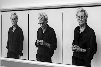
I selected this picture because when I think of portraits, Richard Avedon immediately comes to mind. This specific self-portrait is similar to what we are to do in class, as he made a triptych out of his images. What I like about this triptych is that the images all relate yet show a different perspective along with a different emotion expressed by Avedon. By doing this you are able to see three different personalities of the same person. This photo inspires me to do something similar, where multiple photos of me are used to show different perspectives of my personality to give someone a more holistic view of me. These photos also seem to follow a movement, by doing this Avedon allows the different pictures to look more complete when put together- something to consider when I create my own self-portrait.

I liked this portrait of Henri Cartier-Bresson because a lot of information is given about him in this one photo. Not only are you able to see his actual face, but also the viewer is also able to see the portrait he drew of himself. Therefore we are able to see how he looks and how he physically views himself. When creating my own portrait I may want to create multiple photos that create one composition like Cartier-Bresson did in this photograph.
Part 3:
http://www.channel4.com/culture/microsites/S/selfportraituk/making_selfportrait_01.html
This website was designed for a contest in creating self-portraits. The section titled Making a Self-Portrait points out different ideas and questions to consider before designing your portrait. The size of the image/images will greatly affect how the portrait is viewed and interpreted. Also the artist should consider where the figure or portions of the figure will be located on the page. Is the background going to be part of the photo, or will it just be a solid color. What are you going to express, as posture and mood can greatly change depending on how they are expressed.
What is a self-portrait?
A portrait is a representation of someone, and if it is a self-portrait it is a representation of you. This representation is most commonly in the medium of photography or painting, although any mediums could be used to create a self-portrait. The portrait does not need to be representational, but could be abstract or be a combination of different objects that you believe represents yourself.
What are the distinctive things that make me "me"?
The distinct things that make me who I am, aside from my physical appearance is the experiences I have, how I respond to these experiences and what I am interested in. Some of my chief interests are ceramics and rugby,
How do I want people to see me?
How I want people to see changes with who the person is. I want my teachers and employers to see me as responsible and hard working. My friends should view me as someone they want to hang out- being fun, independent, and adventurous. I want those on opposing rugby teams to see me as fierce, tough and fast. Although I attempt to change that I am, I hope that my personality still somewhat shows through the screens I put up, so that I can be differentiated from those around me.
How can I express my many different sides?
My many different sides are expressed constantly as I move from one situation to the next. Those who I am constantly around are able to see all of these sides, and thus gain a better understanding for who I am. In the majority of situations I try not to modify who I am, thus allowing only who I am to be revealed.
How can I reinvent myself for various purposes or times in my life?
Since people are so visual, the best way to reinvent who you are is to change your appearance. This generally happens on it own; as you change the people you constantly hang out with and see the faults in what you were doing before. As we age we gain more knowledge, which allows us to better shape who we are so that we can transform into who we want to be.
How am I changing from day to day or year to year?
I constantly change day to day depending on the people I am around. While at work or in some classes I attempt to act professional watching what I say and how I act. With my immediate family and friends I am much more free as I have known these people for a long time and no longer need to change who I am, and just act however I feel. When I meet new people I am generally reserved, and the more I am acquainted with the person the more I open up, until my personality is completely revealed. Although even personalities change on a regular basis.
Who do I want to become?
I would like to become someone who is happy with their life- where I have been, where I am and the direction I am heading. I do not want a life that is all planned out, but desire spontaneity and oddities. I hope to reach success in life, although I have yet to determine exactly how I would define success for myself.
Part 2:
I selected this picture because when I think of portraits, Richard Avedon immediately comes to mind. This specific self-portrait is similar to what we are to do in class, as he made a triptych out of his images. What I like about this triptych is that the images all relate yet show a different perspective along with a different emotion expressed by Avedon. By doing this you are able to see three different personalities of the same person. This photo inspires me to do something similar, where multiple photos of me are used to show different perspectives of my personality to give someone a more holistic view of me. These photos also seem to follow a movement, by doing this Avedon allows the different pictures to look more complete when put together- something to consider when I create my own self-portrait.

I liked this portrait of Henri Cartier-Bresson because a lot of information is given about him in this one photo. Not only are you able to see his actual face, but also the viewer is also able to see the portrait he drew of himself. Therefore we are able to see how he looks and how he physically views himself. When creating my own portrait I may want to create multiple photos that create one composition like Cartier-Bresson did in this photograph.
Part 3:
http://www.channel4.com/culture/microsites/S/selfportraituk/making_selfportrait_01.html
This website was designed for a contest in creating self-portraits. The section titled Making a Self-Portrait points out different ideas and questions to consider before designing your portrait. The size of the image/images will greatly affect how the portrait is viewed and interpreted. Also the artist should consider where the figure or portions of the figure will be located on the page. Is the background going to be part of the photo, or will it just be a solid color. What are you going to express, as posture and mood can greatly change depending on how they are expressed.
Friday, March 12, 2010
Photoshop Videos
http://www.adobe.com/designcenter/video_workshop/
- Making and Refining Selections
The selection tool allows you to select specific objects within the photo, and also lets you choose spaces you do not want selected. By refining the selection tool, you are able to see the object on different backgrounds, where you can then adjust the edges of the object.
- Using Layers-
The background layer cannot be changed. One image can be added to another simply by dragging one window into the next. Multiple layers can be selected at one time, allowing you to modify multiple at once. A layer mask allows you to hide or create a gradient of the image.
- Converting Color Photos to Black and White- Russell brown
Different colors, along with the hue and saturation can be adjusted to get the specific look you were after. By doing this you can directly target colors and objects within the photo you are working on.
- Applying Smart Filters
This allows you to adjust a layer without changing it, so that you are able to go back to the original photo. Multiple filters can be added to a single photo. By double clicking on the filter you are able to modify the specific filter.
- Correcting Lighting with Camera Raw The fill light command opens the midtones of a photo. In order to keep the shadows of the original photo it is recommended that you adjust the blacks of photo.
- Making Tonal Corrections
By adjusting the contrast of a photo you can brighten up a photo. An advanced way to adjust the contrast is to use the curves tool, which gives you a diagram of the blacks and whites you can adjust.
- Making Lighting Corrections
The curves adjustment tool allows you to change the lighting on only one side of the photo if desired. The channel mixer adjustment layer can convert an image from color to black and white. Also the black and white command lets you instantly change a photo to black and white, and then you can adjust specific colors to be either darker or lighter/
- Using Vanishing Point in Photoshop
The vanishing point lets you edit the perspective of photo. You are now able to adjust the angle that you want the perspective to be from. CS3 lets you wrap multiple art works at once, so you can move all images in one step.
- Importing Content in to InDesign
When importing an image you can use the frame fitting options, so that content can be fit proportionally or the frame can be filled proportionally. Not only can images be imported, but text can be imported as well.
The video I found most helpful was making and refining selections. As this allows you to select a certain object within a photo, which will be extremely helpful when modifying an image.
What I liked about the videos presented by Mike Ninness is that he concluded each video with a recap. By doing this you are able to remember the important factors presented in the video. I found that the videos presented by Katrin Eismann were very boring, as her voice made it seem as though she did have an interest in what she is presenting. I would prefer if she showed excitement in her voice, as this tends to grab the attention of the listener. Although like Eismann, Terry White sounds monotone, he uses words that make him seem excited, as he constantly claims that he loves certain tools or features within the program. I found the presentation by Russell Brown was very good, as the black and white feature he was presenting on genuinely excited him. Also during his video clip, areas were blown up so that the viewer could see what it was he was clicking on to get the feature he was after.
Tuesday, March 2, 2010
Technical Training Video - Summary and Critique
Technical Training Video - Summary and Critique
http://www.adobe.com/designcenter/video_workshop/
- Making Selections: This feature is similar to that in the other Adobe programs, as there is a regular and direct selection tool. Using these two tools, you are able to resize and crop images or objects, or change their shape. While cropping an image you can get a ghost image, so that you are able to move the picture and put a specific section of the photo into the crop box.
- Working With Text: You are able to apply a specific style to text. By saving the style you can easily access it and apply the same style to other areas of the document. Also you can change the case of a word if you would rather have it all in upper or lower case. At the beginning of a paragraph you can create a character drop, where a large letter is placed at the head of the paragraph.
- Working With Text Styles: When you save a style if you hold down the option key, the panel pops up and you are able to save a specific name for the style.
- Creating Bullets and Numbering: Bullets and numbering can be made by selecting the paragraph you want the bullets and numbering added to, and then selecting the icon from the overhead panel. InDesign automatically will change numbering if you add or delete something.
- Using the Text Wrap Panel: Text can be changed so that it wraps around an object. The text can be manipulated so that it directly surrounds the picture, rather than a square around the photo.
- Managing Pages: By turning the vertical display off, you are able to see pages in a more manageable fashion. Pages can be added to the layout, or if you like a setup you are able to duplicate pages.
Which video was most helpful? What do you think of the different presenters? i found the managing pages video to be most helpful, through my brief encounters with Adobe InDesign, I have had difficulties figuring out how to change the display so you can see multiple spreads. From this video I now understand how to change the layout, so that I can see the various pages desired. I greatly enjoyed Terry White's presentation, as his text was the steps he was describing. This allowed the viewer to not only listen to what he was saying and presenting, but also to read the steps as well. I also found Anne-Marie Concepcion's presentations to be enjoyable as she became excited about the different features she was discussing.
Monday, March 1, 2010
Photobucket
Elements and Principles of Design Slideshow
Before beginning this assignment I read the definitions of the different principles and elements of design. After I gained an understanding of what each of the words were, I began to formulate different possibilities of what to take photos of. During the process of taking photos, I frequently returned to the list of definitions, to be sure each photo was representing what my goal was. When it came to create the photos I attempted to utilize different and interesting angles. The majority of the photos I used in this slideshow were new photos, as only two (line and color) are pictures that I had taken before being assigned this project. When I was ready to shoot the images, I walked around my house and looked for different possibilities of what to create images of; then I took pictures from different viewpoints. After the photos were taken, they were uploaded on to my computer, and I was able to choose which image best represented the principle or element I was attempting to show. Many of the photos had to be cropped, so that only the essential material was being revealed. After all my pictures were selected, I uploaded them to photobucket, which was extremely easy. I then created the slideshow, which took me some time to figure out how to do, but the instructions provided along with the slideshow creation, made it easy for one to use. The only area I experienced difficulty in was deciding what to take pictures of, as a plethora of photos could have been used to show the element or principle.
In conclusion, I found this project helpful, as I have not utilized photobucket in a very long time, and never had made a slideshow before. I now feel confident in using photobucket as a tool.
Tuesday, February 23, 2010
Logo Creation
1. Find an online resource for creating your Logo. Be sure to link the URL in your blog posting.
http://www.entrepreneur.com/marketing/marketingbasics/marketingmaterials/article71902.html
2. Explain how you used/or will use this resource in creating your Logo for your Lab Project #2 assignment.
This website outlines the goals of a logo, and provides steps to help you reach a final design. Various bullets are provided with useful points to think about during your creation of a personal logo. One issue this article addresses is making your logo clean and functional, personally I prefer images that seem chaotic and busy, but this could distract some, so I should aim for something that conveys my aesthetics but is not so busy that the elements become obsolete. Also the logo should depict the message you are trying to convey- therefore as an artist I should try to add my personality into the logo, as it will become an extension of myself. In conclusion this article was very helpful in different points to consider in order to create a successful personal logo.
Friday, February 19, 2010
Technical Training Video - Summary and Critique
Technical Training Video - Summary and Critique
Having never worked with Adobe Illustrator I learned a lot from watching the various videos located at http://www.adobe.com/designcenter/video_workshop/
- Selecting and Manipulating Objects
This video depicted how to select objects, utilizing the two selection tools. The regular selection tool allows you to select the whole object; while with the direct selection tool you are able to grab specific anchor points. These tools are needed to provide the objects with various modifications.
- Using the Line, Eraser, and Shape Tools
Through the shape tool you can create prefabricated geometric shapes that have anchor points. Both the polygon and star allow you to increase or decrease the amount of sides located on your object. The eraser tool works similar to that located on other art based programs, as you drag it to determine where areas are to be erased. The line tool, simply creates lines, but you are able to modify it in different ways: one option is moving the line at 45 degree angles, allowing you to be precise.
- Using the Pen Tool
Through the pen tool, you create objects through anchor points. Every object has a stroke and fill color, which can be adjusted to fit your needs. Once an object is created you are able to change it by modifying the anchor points located along the object.
- Using the Paintbrush Tool
This tool creates marks where the cursor went. The fidelity option changes the amount of anchor points, as well as how smooth the mark is. Different brush strokes are available, including ones that resemble banners or pictures located along the mark you created.
- Using the Pencil Tool
This is similar to the paintbrush tool. You are able to modify and create strokes. Through this tool you can modify any object, even if it wasn’t originally created by the pencil tool.
- Scaling, Skewing and Rotating Objects
Scaling can be done uniformly or non-uniformly. When shearing an object you can click outside the object and then drag the object to the angle you wish it to be. Free transformation allows you to scale and shear an object, as well as distort it with perspective.
- Creating Point and Area Type
Point text is defined by 1 anchor point, which can be aligned in different areas, such as center, left and right. Area type defines an area, and type fills it, in area type you can create columns of text.
- Creating Type on a Path
There are start and end point on a path that can be changed to determine where text is located along a path. By dragging the text, the words will move up and down the path; also if you pull it down, the text will flip to the other side of the line and vise versa.
I found that the most helpful videos were those about using the different drawing tools. All the tools seem to do the same thing, and had I not watched these videos differentiating their functions I would not understand how to use them or their specialties. For example I never would have figured out that the pencil tool allows you to modify any object, even those not created by the pencil.
Both of the people presenting the videos had a video instruction along with their voice telling you how to manipulate the tools. Personally I found Matt Richmond, the presenter who demonstrated the first 6 videos easier to understand. He spoke clearly and used different voice intonations during his descriptions. Also at the end of his videos he did a one-sentence recap to inform the viewer on the major function of what he was presenting. Mordy Golding presented the last two videos, and I found his speech impediment a bit distracting. Also his directions seemed less unsure and planned as Richmond’s
Tuesday, February 9, 2010
Lesson Writing Help
1. http://www.salvadordalimuseum.org/education/lessons.html
2. For my lesson plan, I only had a rough idea of what I was going to do for it. The idea I was working with was having students monitor their dreams, and then create an artwork utilizing elements of the dreams they had. The elements from their dreams are mixed with elements of a landscape they are unfamiliar with (such as space or under water). The media in which I would use this lesson was undecided, but I was leaning towards paint. After reviewing this website and the different lesson plans located on it, I decided that collage would be a good medium to work with. Thus I have determined to create a lesson plan that utilizes collage techniques along with painting, so that students are able to create the artwork they envisioned- since not all pictures desired can be found in magazine and newspaper clippings.
2. For my lesson plan, I only had a rough idea of what I was going to do for it. The idea I was working with was having students monitor their dreams, and then create an artwork utilizing elements of the dreams they had. The elements from their dreams are mixed with elements of a landscape they are unfamiliar with (such as space or under water). The media in which I would use this lesson was undecided, but I was leaning towards paint. After reviewing this website and the different lesson plans located on it, I decided that collage would be a good medium to work with. Thus I have determined to create a lesson plan that utilizes collage techniques along with painting, so that students are able to create the artwork they envisioned- since not all pictures desired can be found in magazine and newspaper clippings.
Friday, February 5, 2010
PowerPoint Help
1. http://www.microsoft.com/canada/home/home-office/articles/help-find-powerpoint-answers.aspx
2. I found this website helpful in providing the basics on creating and adjusting your PowerPoint slides. Prior to looking at this website, I did not know that it was possible to create a master slide, so that all of your slides within the presentation can be unified by having the same layout.
Also this website provides steps on how to create your own background for slides. Doing this allows for a completely unique presentation, and would be extremely helpful when using PowerPoint as a teacher. You can modify the background so that it ties in with the theme of what your presentation is about.
The website goes on to explain how to insert files, animation and videos into your presentation. These are all useful techniques to know, so that you can make the most out of your presentation. When using PowerPoint for younger children it is important to keep the presentation exciting, so the students pay attention without becoming bored. Animation, videos and various files you may have are key ways to maintain a successful PowerPoint presentation.
Monday, February 1, 2010
Visit to The Albright Knox Art Gallery
Which artworks make an impact or impression on me? Why?
1. Hare. Sunrise
This work created an impact on me, because I find it so interesting to look at. Movement is made throughout the piece as your eye travels through each element. Also the various materials within this piece are utilized together to create a unified whole.
2. Pollock. Convergence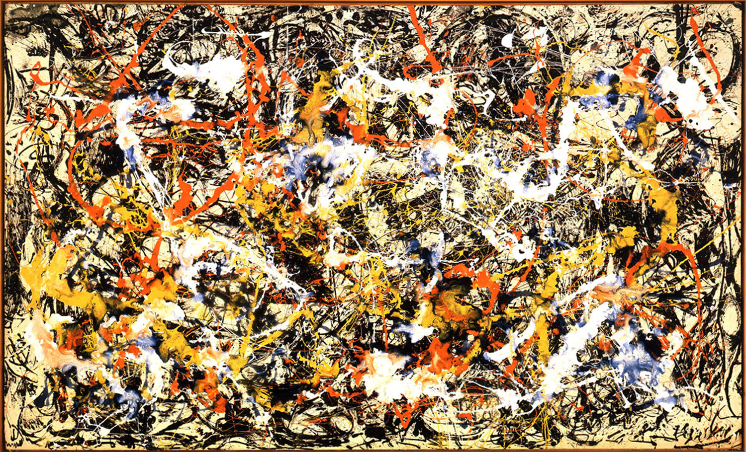
Anyone can create a piece that is abstract, but few can do so as Pollock could. Aside form the large scale this piece has, it is also very aesthetically pleasing as the formal elements work together to draw in the viewer and keep them staring at the art work.
3. Giacometti. Man Walking.
This work is abstract, yet detailed enough to reveal the essentials. I still am amazed at artists who are able to create only what is needed without going to far.
4. Marc. The Wolves (Balkan War)
the use of color made the primary impact on me. The colors utilized are surreal, yet the blocks of color and shading allow the viewer to see the narrative that is being depicted.
5. Van Gogh. Old Mill
The texture in this piece, as well as in all of Van Gogh's art work created an impression on me. Movement is created within his work, simply by the painterly wa y he utilizes. Also he is able to create detail and shading in his work, yet make it seem almost abstracted.
Which artworks do I feel a connection with? Why?
1. Soutine. Carcass of Beef.
I feel a connection with this piece because some of the work I create deals with carcasses of animals and humans. Not only do I see a similarity in his work and mine, but other people have mentioned this to me as well.
2. Matisse. Musique.
I feel a connection with this piece because I can recall it being pointed out to me during the first visits I ever had at the art gallery. Not only was this piece highlighted to me, but it was one of the ones I was
attracted to at a young age. Most likely for the vivid colors, and exaggerated features.
3. .Samaras. Mirrored Room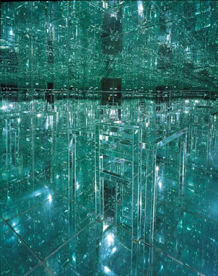
This room had been my favorite piece when I was young, as it was interactive. Now I feel as though it is always closed when I visit the art museaum, but perhaps sometime soon I will be able to enter it and see if I still feel the same way I did while being inside of this room at a young age.
4 Picasso. Woman’s Head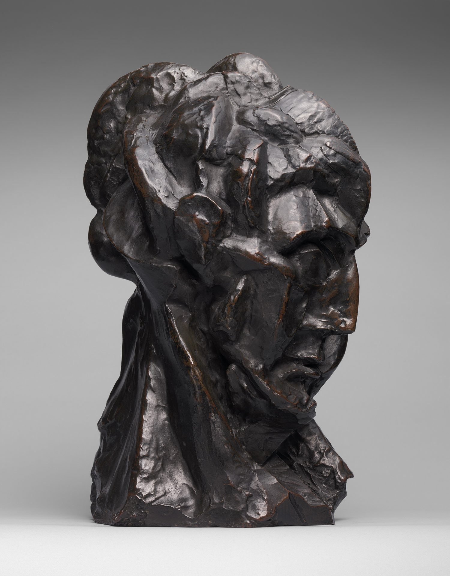
This sculptural piece takes on the form of a face, which is only determined to be female due to the title. I feel a connection
with this piece because only the important elements of a human head are defined, and that is all that is truly need to rely Picasso’s intentions. When I use the human figure in my own work in ceramics, only the important elements are used, so only what is nessecary can be seen- allowing the viewer to get straight to the concept of the piece.
5.Tissot. L'Ambitiuse
I feel a connection with this artwork, because it was one part of an Albright Knox art exhibit I attened when I was younger. After viewing all the artwork, my mother allowed us to pick out a souvenior to remember the show by: I choose a notepad that had this image depicted on it. I still have the notepad, because I liked it so much when I was little that I did not want to use it, because I thought it would get ruined.
Which artworks would I like to know more about? Why?
1. Jehan Georges Vibert. The Marvelous Sauce
I would like to know the context behind this piece. There seems to be a story occurring within the work.
2.Tangou. Indefinite Divisibility.
This work takes on the appearance of a 3D object, yet is created on a 2D campus. I would be interested in learning more about the artist and seeing why he chose to work in paint rather than sculpture.
3. Seurat. Le Chahut.
Seurat has an amazing knowledge of color, as he is able to make colors appears has whole areas when only dots are utilized. In would be interested in learning more about his color knowledge.
4. Donovan. Untiled
This large floor piece, appears to be materials layered to form a plethora of spherical forms that seem almost solid. I would be interested in learning the concept behind this work of art, as it was untitled and thus difficult to imagine what the artist’s intentions were.
5.Apfelbaum. Reckless
I would be interested in learning more about this artist, and the techniques utilized to create this piece. I would assume that the piece is created in parts and then assembled, but this could not be the case. As with any large work the process is always somewhat diffficult- therefore I would like to know how it was made.
1. Hare. Sunrise
This work created an impact on me, because I find it so interesting to look at. Movement is made throughout the piece as your eye travels through each element. Also the various materials within this piece are utilized together to create a unified whole.
2. Pollock. Convergence
Anyone can create a piece that is abstract, but few can do so as Pollock could. Aside form the large scale this piece has, it is also very aesthetically pleasing as the formal elements work together to draw in the viewer and keep them staring at the art work.
3. Giacometti. Man Walking.
This work is abstract, yet detailed enough to reveal the essentials. I still am amazed at artists who are able to create only what is needed without going to far.
4. Marc. The Wolves (Balkan War)
the use of color made the primary impact on me. The colors utilized are surreal, yet the blocks of color and shading allow the viewer to see the narrative that is being depicted.
5. Van Gogh. Old Mill
The texture in this piece, as well as in all of Van Gogh's art work created an impression on me. Movement is created within his work, simply by the painterly wa
y he utilizes. Also he is able to create detail and shading in his work, yet make it seem almost abstracted.Which artworks do I feel a connection with? Why?
1. Soutine. Carcass of Beef.
I feel a connection with this piece because some of the work I create deals with carcasses of animals and humans. Not only do I see a similarity in his work and mine, but other people have mentioned this to me as well.
2. Matisse. Musique.
I feel a connection with this piece because I can recall it being pointed out to me during the first visits I ever had at the art gallery. Not only was this piece highlighted to me, but it was one of the ones I was
attracted to at a young age. Most likely for the vivid colors, and exaggerated features.
3. .Samaras. Mirrored Room
This room had been my favorite piece when I was young, as it was interactive. Now I feel as though it is always closed when I visit the art museaum, but perhaps sometime soon I will be able to enter it and see if I still feel the same way I did while being inside of this room at a young age.
4 Picasso. Woman’s Head
This sculptural piece takes on the form of a face, which is only determined to be female due to the title. I feel a connection
with this piece because only the important elements of a human head are defined, and that is all that is truly need to rely Picasso’s intentions. When I use the human figure in my own work in ceramics, only the important elements are used, so only what is nessecary can be seen- allowing the viewer to get straight to the concept of the piece.
5.Tissot. L'Ambitiuse
I feel a connection with this artwork, because it was one part
of an Albright Knox art exhibit I attened when I was younger. After viewing all the artwork, my mother allowed us to pick out a souvenior to remember the show by: I choose a notepad that had this image depicted on it. I still have the notepad, because I liked it so much when I was little that I did not want to use it, because I thought it would get ruined.Which artworks would I like to know more about? Why?
1. Jehan Georges Vibert. The Marvelous Sauce
I would like to know the context behind this piece. There seems to be a story occurring within the work.
2.Tangou. Indefinite Divisibility.
This work takes on the appearance of a 3D object, yet is created on a 2D campus. I would be interested in learning more about the artist and seeing why he chose to work in paint rather than sculpture.
3. Seurat. Le Chahut.
Seurat has an amazing knowledge of color, as he is able to make colors appears has whole areas when only dots are utilized. In would be interested in learning more about his color knowledge.
4. Donovan. Untiled
This large floor piece, appears to be materials layered to form a plethora of spherical forms that seem almost solid. I would be interested in learning the concept behind this work of art, as it was untitled and thus difficult to imagine what the artist’s intentions were.
5.Apfelbaum. Reckless
I would be interested in learning more about this artist, and the techniques utilized to create this piece. I would assume that the piece is created in parts and then assembled, but this could not be the case. As with any large work the process is always somewhat diffficult- therefore I would like to know how it was made.
Monday, January 25, 2010
Why do you want to be an Art Educator?
Since I was young, I have always held an interest in art. This interested was developed throughout my education and determined that I would follow a path into a career in art. Originally I majored solely in ceramics, but later added the second degree of art education, when I realized how I could utilize my love for children, as well as art. As an art educator I have the power to introduce and assist in developing art and artistic skills in children and young adults. My goal as an art educator is to teach the importance that art has on our current world and society, and how even those who are not seeking a career in art can benefit from artistic knowledge.
Subscribe to:
Comments (Atom)